
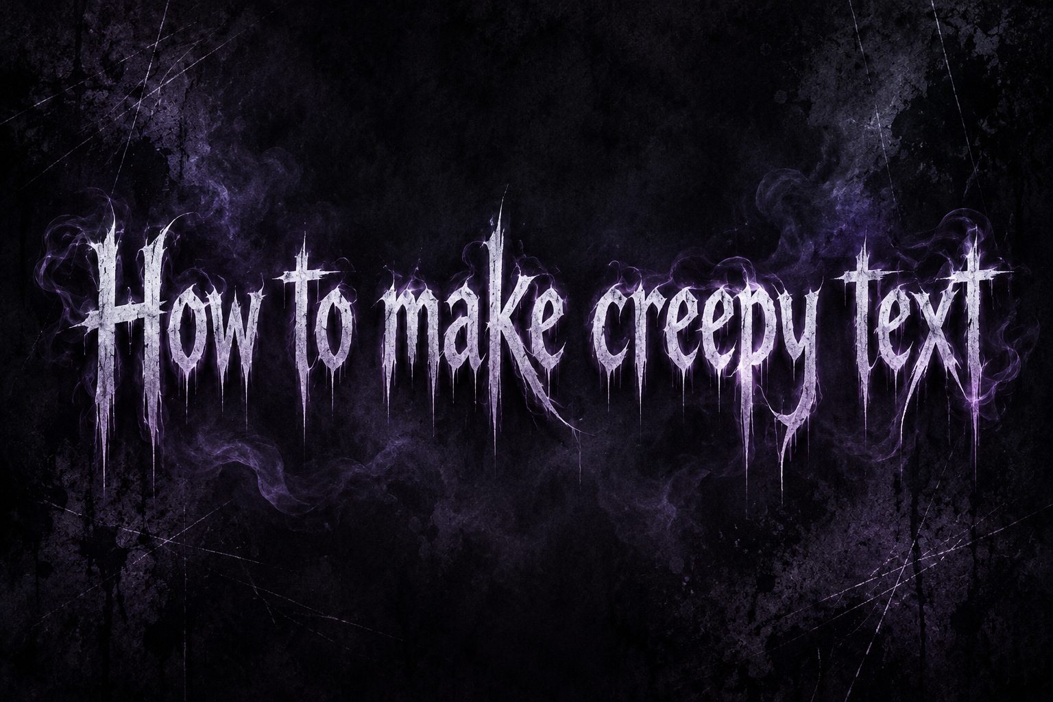
Learning how to make creepy text is useful when you want words to feel unsettling before a reader even processes their meaning. The effect can come from distorted Unicode characters, ominous wording, unusual spacing, eerie typography, or a careful combination of these elements. You might use creepy writing for a Halloween invitation, horror story, game, social media post, haunted attraction, or fictional warning. However, effective creepy text is not simply a collection of random symbols. It must match the mood, remain readable, and work on the platform where it appears. This guide explains what creepy text means, why it creates a strong emotional response, and how to produce it step by step. You will also find practical methods, examples, common mistakes, expert tips, use cases, and answers to frequent questions. By the end, you will know how to create disturbing text that feels intentional rather than messy.
What Makes Text Look Creepy
Creepy text creates discomfort by making familiar language feel slightly wrong. Readers recognize the words, but visual or verbal details suggest that something unusual is happening.
Distorted letters can resemble damaged printing, corrupted data, ancient writing, or a message affected by an unknown force. This visual instability makes ordinary words appear less predictable.
Language also shapes the effect. Short warnings, unexplained observations, broken sentences, and references to silence or darkness can create tension without describing anything graphic.
Context matters just as much as appearance. A strange sentence displayed in a horror game may feel frightening, while the same sentence in a cheerful advertisement may only seem confusing.
The strongest results usually combine restraint with purpose. One altered word can attract more attention than an entire paragraph covered in marks, particularly when the surrounding design is clean.
Creepy writing therefore works through contrast. It interrupts normal reading patterns just enough to suggest danger, mystery, decay, possession, surveillance, or another unsettling idea.
Why Creepy Text Creates An Emotional Effect
Several creative choices can make eerie writing feel convincing. Each one changes how quickly readers process the message and what they imagine behind it.
- Unfamiliar Shapes: Altered characters make recognizable words look unstable, damaged, or unnatural.
- Broken Rhythm: Sudden pauses and sentence fragments encourage readers to slow down and anticipate what comes next.
- Implied Danger: A restrained warning lets the audience imagine a threat instead of showing everything directly.
- Visual Contrast: One distorted phrase surrounded by normal text becomes an immediate focal point.
- Ambiguity: Missing details create questions, allowing the reader’s imagination to complete the frightening scenario.
- Personal Address: Carefully used words such as “you” can make a fictional message feel immediate and uncomfortably close.
How To Make Creepy Text Step By Step
A simple process helps you create text that supports the intended atmosphere while remaining suitable for its audience and platform.
- Choose The Purpose: Decide whether the text is for a story, poster, username, game, invitation, or another project.
- Select The Mood: Define the feeling as haunted, corrupted, ancient, supernatural, threatening, or mysteriously calm.
- Write A Plain Version: Create a clear sentence before changing its appearance, wording, spacing, or punctuation.
- Shorten The Message: Remove unnecessary explanation so the most disturbing idea receives the greatest attention.
- Add One Main Effect: Apply distorted characters, irregular spacing, repetition, or fragmented language with restraint.
- Create Visual Contrast: Keep some words normal so the altered parts look intentional and remain easy to notice.
- Test Readability: View the result on different screens and confirm that the essential message can still be understood.
- Check The Tone: Make sure the content suits the audience and cannot easily be mistaken for a genuine threat.
- Save A Plain Copy: Keep an accessible version for search fields, captions, screen readers, and platforms that reject special characters.
Popular Methods For Making Creepy Text
Different techniques create different kinds of unease. Choose a method that supports the story or visual theme instead of applying every effect at once.
1. Add Combining Unicode Marks
Combining marks can appear above, below, or through ordinary letters, producing the corrupted style often called glitch or Zalgo text. Start with only a few marks around important words. Heavy stacking may overlap nearby lines, break layouts, or turn an otherwise effective phrase into an unreadable block.
2. Use Unusual Letter Variants
Unicode includes letter-like symbols that resemble characters from different alphabets, mathematical sets, and decorative styles. Substituting a small number can make familiar writing feel foreign. Check the meaning and origin of every character, however, because careless substitutions may be inaccurate, confusing, or culturally insensitive.
3. Break Sentences Into Fragments
Fragments remove the comfortable rhythm of complete sentences. A sequence such as “The door moved. No wind. No footsteps.” leaves gaps the reader must mentally fill. Keep the central situation understandable, because random fragments without a coherent scene usually create confusion rather than suspense.
4. Change Spacing And Punctuation
Wide gaps can suggest a slow voice, while missing spaces can imply panic or digital corruption. Repeated periods may create an unnatural pause. Use these techniques selectively and test them on mobile devices, since automatic line wrapping can change the rhythm or separate words in unintended places.
5. Repeat A Disturbing Detail
Repetition becomes creepy when a harmless phrase returns at an unexpected moment. Repeat a word, time, sound, or instruction two or three times, then introduce a small variation. Excessive repetition quickly loses tension, so stop while the pattern still feels deliberate and unresolved.
6. Pair Calm Language With Unease
A calm voice describing an impossible situation can be more disturbing than dramatic language. Polite instructions, routine announcements, or reassuring statements become eerie when one detail is clearly wrong. This contrast works especially well in psychological horror, found-footage stories, fictional notices, and narrative games.
Examples Of Creepy Text Styles
These approaches show how wording and presentation can create distinct moods without depending on graphic descriptions or excessive decoration.
1. The Unexplained Warning
A line such as “Do not answer the third knock” works because it gives a precise instruction without explaining the consequence. The missing reason creates tension. This style is effective for posters, invitations, game clues, and chapter openings where mystery matters more than visual distortion.
2. The Corrupted Message
Start with a normal sentence, then alter one important word using a small number of combining marks or unusual characters. The isolated corruption suggests interference while preserving meaning. It works particularly well for fictional computer logs, haunted-device stories, science-fiction horror, and digital game interfaces.
3. The Repeated Observation
Use a simple observation that becomes stranger through repetition, such as a clock stopping at the same minute each night. On its final appearance, change one detail. The pattern prepares the reader to notice the difference, allowing a quiet sentence to deliver a strong unsettling effect.
4. The Broken Whisper
Short lowercase fragments can imitate a hesitant whisper or interrupted thought. Strategic pauses make the reader supply the missing information. Avoid separating every word, because constant fragmentation becomes tiring. Reserve the broken rhythm for the most uncertain, secretive, or emotionally tense moment in the message.
5. The Formal Notice
A formal notice becomes creepy when official language addresses an impossible event. Clear instructions and neutral wording make the scenario feel strangely credible. This format suits escape rooms, immersive theater, horror games, and fictional documents because the professional tone contrasts sharply with the unnatural situation.
6. The Almost Normal Sentence
Write an ordinary sentence and add one detail that should not be possible, such as a reflection moving late or an empty room breathing. Because most of the sentence feels familiar, the impossible element receives extra emphasis. This method produces subtle horror without special characters.
Practical Creepy Text Use Cases
The right style depends on where the writing will appear, how long readers will see it, and whether it needs to communicate practical information.
1. Halloween Invitations
Creepy lettering can establish the theme before guests read the event details. Use dramatic styling for a short opening phrase, but keep the date, time, location, costume guidance, and contact information plain. Decorative text should create atmosphere without making essential details difficult to find.
2. Horror Stories
Authors can use altered formatting to distinguish letters, whispers, visions, recordings, or supernatural messages from regular narration. Apply the effect at meaningful moments rather than throughout every page. Rare visual changes feel important, while constant changes distract readers from character, pacing, and plot.
3. Video Games
Creepy text can appear in menus, warnings, collectible notes, dialogue, or environmental clues. The design must remain readable during play and work at different resolutions. Developers should also provide accessible alternatives when distortion, flickering, or unusual characters could interfere with comprehension or player comfort.
4. Social Media Posts
A short eerie caption can support seasonal content, fictional storytelling, or a horror-themed campaign. Special characters may display differently across devices and can reduce searchability. Keep important names in standard letters, use a plain caption when necessary, and avoid wording that resembles a real threat.
5. Haunted Attractions
Signs and fictional notices can guide visitors while strengthening the attraction’s story. Directional and safety information must remain completely clear, even when surrounding copy uses an eerie voice. Atmosphere should never obscure exit instructions, health warnings, age guidance, or staff directions.
6. Usernames And Display Names
Decorative characters can give a profile a dark or mysterious identity, but complicated names are harder to type, search, remember, and mention. Use one recognizable element and retain a plain version for account recovery or sharing. Confirm that the platform accepts every chosen character.
Common Creepy Text Mistakes To Avoid
Creepy writing loses its impact when decoration overwhelms meaning or the tone ignores its real-world context.
1. Distorting Every Character
Covering every letter with marks may initially look dramatic, but readers often stop trying to decode it. Distort a title, keyword, or brief phrase instead. Surrounding normal text provides contrast, improves accessibility, and makes the corrupted section look like an intentional creative choice.
2. Using Too Many Effects
Combining unusual fonts, heavy symbols, repeated punctuation, random capitalization, and wide spacing can produce visual noise. Select one dominant technique and one supporting technique. A limited system gives the design a recognizable style and keeps attention on the emotional purpose of the message.
3. Forgetting Device Compatibility
Some special characters appear as empty boxes, replacement symbols, or misaligned marks on certain operating systems. Test the text in the actual app, browser, and device types your audience uses. If compatibility is uncertain, rely more heavily on strong wording and ordinary punctuation.
4. Copying Symbols Without Checking Them
A decorative symbol may have a religious, political, linguistic, or cultural meaning that does not match your project. Research unfamiliar marks before using them. Choosing symbols purely for appearance can create unintended messages, offend readers, or make the final result seem careless rather than mysterious.
5. Making Fiction Sound Like A Real Threat
Contextless warnings aimed directly at individuals can cause genuine concern, especially in public posts or private messages. Clearly frame horror content as fiction, entertainment, or an event theme when confusion is possible. Never use creepy text to intimidate, harass, impersonate, or frighten a real person.
6. Ignoring Accessibility
Screen readers may pronounce stylized Unicode unpredictably, and dense combining marks can be difficult for people with visual or cognitive disabilities. Provide the essential wording in standard characters and maintain clear structure. Accessibility expands the audience without preventing you from using decorative effects selectively.
Best Practices For Effective Creepy Text
A few disciplined choices can make unsettling writing clearer, more original, and more memorable.
1. Begin With Strong Plain Language
The sentence should create tension before any visual styling is added. Write a concise message with a specific image, warning, or unanswered question. If the plain version has no atmosphere, decorative characters will rarely fix it. Strong wording remains effective even when formatting fails.
2. Match The Effect To The Story
Glitch marks suit corrupted technology, while faded fragments may suit ghosts or recovered letters. Formal wording can support institutional horror, and repeated phrases can suggest obsession. Connecting presentation to the fictional cause makes the text feel like part of the world rather than decoration.
3. Preserve A Readable Core
Readers should quickly recognize at least the central phrase. Leave important nouns and instructions clear, then distort supporting characters or a single key word. This balance creates a moment of uncertainty without demanding so much effort that the audience abandons the message entirely.
4. Use Silence And Space
Fear often grows in what is omitted. A short sentence followed by a pause can create more tension than a long explanation. Use blank space, restrained punctuation, or an abrupt ending to let the audience imagine what remains unseen, while keeping the layout stable.
5. Test The Result In Context
Text that looks effective in an editor may fail inside a small profile field, printed sign, mobile game, or social post. Preview the final size and background, then ask whether the style supports the intended action. Revise anything that delays essential comprehension.
6. Keep The Audience In Mind
A playful Halloween message requires a different intensity from adult psychological horror. Consider age, expectations, cultural context, and where the content will appear. Aim for suspense appropriate to the setting, and include clear framing or content guidance when the material could genuinely disturb readers.
Advanced Tips For More Original Creepy Writing
Once the basics are clear, more deliberate narrative techniques can make creepy text feel distinctive instead of copied from a generator.
1. Build A Consistent Rule
Create a repeatable visual rule, such as distorting only names, times, or references to one mysterious character. Readers may gradually recognize the pattern and anticipate its meaning. Consistency turns decoration into storytelling and can reward close attention across a longer project.
2. Introduce A Small Change
Repeat an earlier message almost exactly, then alter one word, number, or pronoun. The reader notices that something has shifted and begins searching for a cause. Small deviations are often more unsettling than completely new messages because they violate an established expectation.
3. Control The Reading Speed
Sentence length, spacing, and punctuation determine how quickly a message is processed. Short clauses can feel urgent, while measured sentences create cold confidence. Plan the rhythm aloud before adding visual effects. The sound of the wording should support the same emotion as its appearance.
4. Suggest A Source Behind The Message
Decide who or what supposedly created the text. A frightened witness, damaged machine, ancient presence, and cheerful automated system will use different vocabulary. Even if the source is never revealed, writing from a defined perspective produces more coherent and believable creepy content.
5. Let Normality Carry The Horror
Place the disturbing detail inside a familiar format such as a reminder, receipt, weather report, or customer notice. The predictable structure lowers the reader’s guard. One impossible statement then feels especially wrong because it appears where practical, harmless information normally belongs.
6. End Before Explaining Everything
Overexplaining removes mystery and limits the reader’s imagination. Give enough information to establish a situation, then stop at the moment of greatest uncertainty. An unresolved instruction, interrupted sentence, or unexplained change can linger longer than a complete description of the fictional danger.
How To Keep Creepy Text Readable
Readability is not the enemy of atmosphere. It gives the unsettling idea a reliable path to the audience.
Limit Distortion: Alter only the characters needed to establish the effect, leaving most of the sentence easy to scan.
Protect Essential Details: Keep dates, directions, safety information, names, and calls to action in standard characters.
Use Clear Contrast: Make sure the text remains visible against its background without relying on distortion alone.
Check Small Screens: Review wrapping, clipping, character height, and spacing on a typical mobile display.
Prepare Plain Text: Maintain a standard version for accessibility tools, search fields, captions, and unsupported platforms.
Read It Aloud: Confirm that the sentence rhythm creates tension even when the special formatting is removed.
Ask For Feedback: Have another person describe what they can read, what they feel, and where confusion begins.
Frequently Asked Questions
1. What Is Creepy Text?
Creepy text is writing designed to create unease through distorted characters, unusual spacing, fragmented sentences, ominous wording, or unsettling context. It can be visually decorative or completely plain. The defining feature is the emotional effect it creates, not any single font, symbol set, or generator.
2. What Is Zalgo Text?
Zalgo text is a glitch-like style made by stacking Unicode combining marks above, below, and across ordinary letters. It can suggest digital corruption or supernatural interference. Because dense marks may overlap lines and confuse assistive technology, it is best used sparingly on short, nonessential phrases.
3. Can I Make Creepy Text Without Special Characters?
Yes. Ominous wording, sentence fragments, strategic repetition, unusual pauses, and unexplained details can create a stronger effect than decorative symbols. A clear sentence containing one impossible observation is often highly effective. Plain characters also improve compatibility, accessibility, copying, searching, and display across platforms.
4. Why Does Creepy Text Show Empty Boxes?
Empty boxes usually mean the device, operating system, app, or selected font does not support a character. Replace unsupported symbols with common Unicode characters or ordinary letters. Always test the final message where it will appear, particularly if readers use several types of devices.
5. Is Creepy Unicode Text Accessible?
It is not always accessible. Screen readers may pronounce decorative characters individually, ignore combining marks, or produce confusing speech. Dense styling can also challenge visual readers. Provide essential information in normal text, use semantic headings where appropriate, and treat distorted writing as a limited decorative layer.
6. How Much Distortion Should I Use?
Use the smallest amount that clearly establishes the mood. One corrupted word in an otherwise normal sentence is often enough. If readers cannot recognize the main idea within a few seconds, reduce the marks, symbols, spacing, or substitutions until atmosphere and comprehension feel balanced.
7. Can Creepy Text Be Used In Usernames?
It can, provided the platform accepts the characters and the name remains identifiable. Highly decorative usernames are difficult to search, type, tag, or remember. Keep a recognizable core in standard letters, test the display on multiple devices, and retain a plain version for sharing.
Conclusion
Effective creepy text combines purposeful wording, controlled visual effects, and the right context. Start with a strong plain sentence, choose a mood, and apply one technique such as Unicode distortion, repetition, fragmentation, or unusual spacing. Keep the central message readable, test it on the intended platform, and match the intensity to the audience.
The most memorable results usually leave room for imagination. A subtle change, unanswered warning, or impossible detail can produce more tension than a page filled with symbols. Use restraint, preserve accessibility, and make every strange choice support the story or experience you want to create.
Discussion